Thursday 1 May 2014

Hair Colouring Tutorial

I've seen lots of tutorials and such like on the internet when I've wanted to try a different style of drawing or painting.  Since there is really no right or wrong way to draw in your own style I've found that learning techniques that other people use helps to perfect mine (that along with practicing constantly).

So I decided to make my own tutorial in order to let people understand how I do my own colouring, if anyone was really impressed by it in previous images, now I can do for them what my favourite artists do for me.

Link to larger version >here<


Saturday 5 April 2014

Favourite Artist Post 5

Recently, I've signed myself back up to DeviantART to display my work.  I was on that site when I was much younger and didn't really have a good enough grasp on basic drawing, now I'm much more confident in my abilities and am able to navigate the site effectively.  One of the perks of being able to use a site like that to its full potential is the fact that it's much easier to find other artists that appeal to my interests.

It just so happens that I came across an artist whose style I find really interesting.  It is a little dark, almost macabre in the way she paints almost like something Tim Burton himself would do.  She is known on DeviantART as IrenHorrors.


I love the use of her lines in these images, it looks to me as if she's used a calligraphy pen to complete the look, which I find really beautiful.

You can find her DeviantART account >>here<<


Wednesday 2 April 2014

Links to my pages

Hello!

I realise that just one blog really isn't enough these days, what with so many people using the internet.  If I want to get anywhere with publishing my work online I need to cover most social networking platforms!  So to those who are interested you can find my work on various different sites scattered across the internet.

They are:


Favourite Artist Post 4

One of my all time favourite animators is Hayao Miyazaki who is the founder of Studio Ghibli in Japan.  Studio Ghibli is almost like the Disney of the Eastern world, but I find his animation to be so beautiful and smooth it's envious.

A few of my favourite films of theirs is My Neighbour Totoro


Spirited Away


Howl's Moving Castle


and Arrietty

The thing I love most about these films may be the way they animate the food, it looks delicious enough that it makes you hungry!  I think they're just so smooth and flawless it's hard to find another animation company to compare it to.

Sunday 16 March 2014

Self Portrait

For our Degree show this upcoming May our class decided to complete self portraits in order to identify each others work.  Last year we all had flip books of ourselves, so this year it is our own self portrait in our own style of illustration.


I've not finished this portrait mainly because I wanted to add a few more things that represent myself into it, and to also refine the colouring a little more.


I added one of my favourite characters from Studio Ghibli's Spirited Away, along with the symbol of one of my favourite bands.  Both art and music mean a lot to me so it's important that they be represented in my self portrait.


Sunday 9 March 2014

Stark's Coffee & Comics

A friend of mine, who is an admirer of my work, is setting up his own business for a coffee and comic book shop in Liverpool.  He wanted it to be strongly based on comic books and asked me if I would draw him and his two partners into a comic book format.  This will be used in his promotional video for the shop and hopefully he'll ask me to do more artwork for him in the future.

The brief was to have a front cover, as if it was a real comic and then a first page inside.  So far I am working on the front cover for the comic.


Monday 10 February 2014

Personal Project 3

To try different ways of colouring I drew myself a very stylised self-portrait to colour, usually I have black lines around my images to hold them all together.  This time I coloured each of the outlines a slightly darker shade of the colour that was going to fill that immediate area.

I've noticed this technique used in a few animations I'm attached to, one being My Little Pony: Friendship is Magic, where the outline of the ponies is darker than the fill colour.


I've kept this technique in mind when I've been creating my image, the difference is that I've tried to blend the line into the actual colouring of the area, so say if an area is slightly lighter, the line will also be lighter.


Animatic


To go along with the Comic Book project at the beginning of this academic year, I had also produced a short animatic from the same script.  I chose to work backwards from the end in case I could do a vast amount, but it would still make sense if I could only do the very end of the script.  I chose to steer away from the very beginning, since I'd already put that in a comic book form so it makes a change from doing the same thing over and over.

Music: Bon Jovi - Dead or Alive

Birthday Project

For a friend's birthday I decided to draw a picture, it's always a wonderful excuse to practice different techniques, or to sharpen skills in a certain area.  This time I've been trying out a new way of lining my images so that there isn't always a hideous (occasionally) black line around the image.

So, recently, I've been starting to draw my initials in my sketchbook and then colour them in photoshop later.  It's a good way to keep up both sets of skills instead of relying on just one.


For the background I used an image of her own (her page is >>Facebook<<  and >>Tumblr<<)

Monday 20 January 2014

Final Pages from University Project 1

Finally I am able to post the four pages from my first project in University, I asked permission to post as long as I copyrighted the images to me!  So here are my four pages, the first I had to redo because I wanted an establishing shot to give the comic perspective, instead of just launching into the action.


All images are copyright to Sarah Diamond.

Wednesday 15 January 2014

Poster Project Update

Finally these two images were the winners, the Dance Department loved them and decided to use them both as their posters.  I am pretty pleased with how they turned out and it gave me a chance to draw and digitally paint them in a new way.


Tuesday 14 January 2014

Poster Project

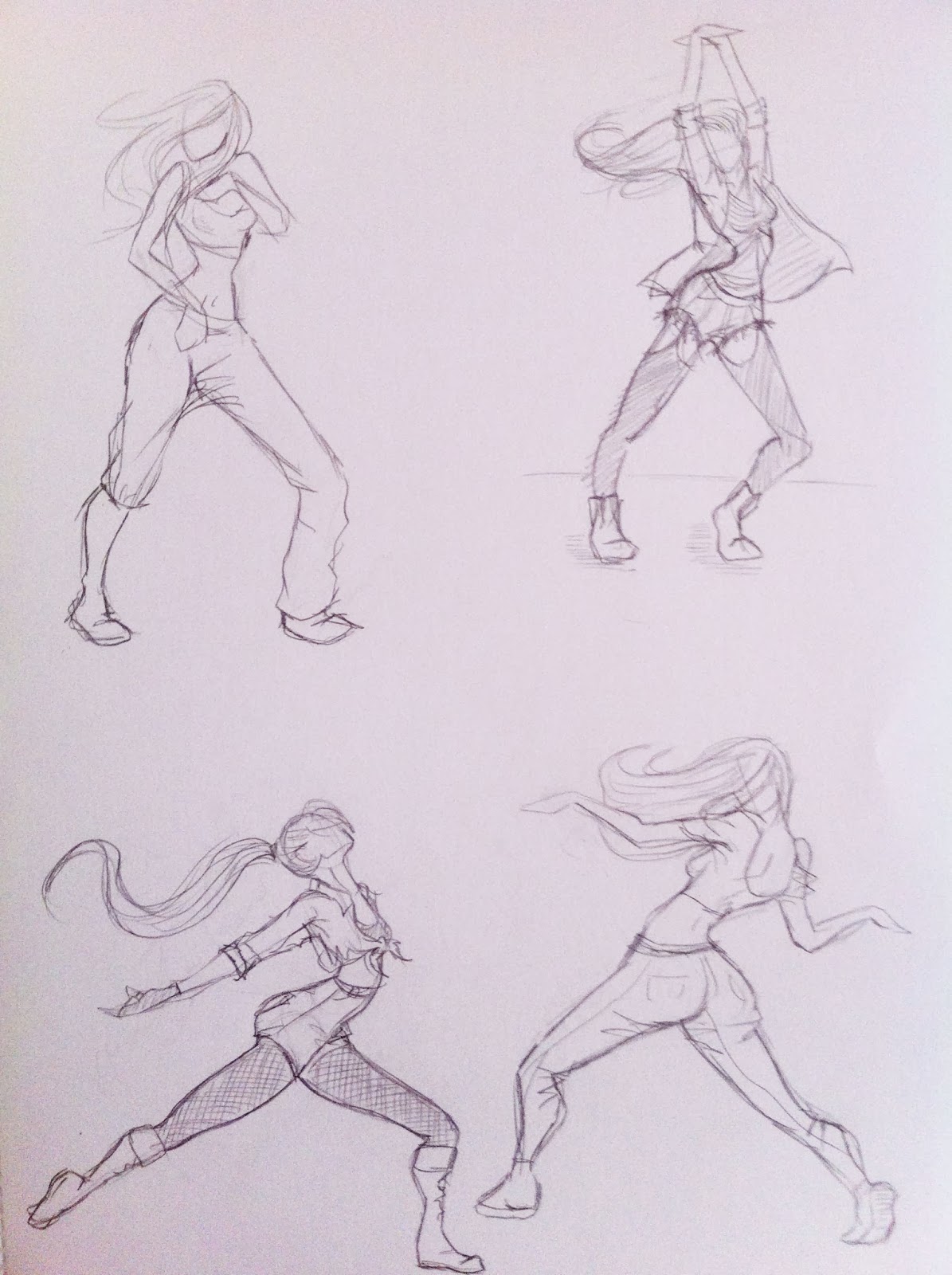
Another Project that cropped up recently was for a Dance Class poster, I started with a few ideas for poses, since it was a Street/Jazz/Contemporary dance class I stuck with the "street" style, which was difficult to capture in just one static image.  I circled the poses that I liked best:


Again sticking with the Street style I thought about what I associate with the word and came up with a graffiti style for the poster. 

This wasn't well received, whether it be the style of my choice or the dance pose, they wanted something softer than the bold image I'd created.  They picked two poses they liked best and asked me to work them up with a soft colour gradient behind it:


There may be more to these images once I have the feedback, I've played with the backgrounds on both of them but I may have to show those after I gain my feedback for these.

Christmas Project

Over Christmas people ask me to draw a lot of things for them, usually something to give to a loved one for Christmas or something similar.  Recently I was asked to draw a pretty unusual card for someone's girlfriend.


Clearly it isn't the usual Christmas scene but I really enjoyed it and saw an opportunity for me to try out, trying to sell greetings cards or even creating e-cards.